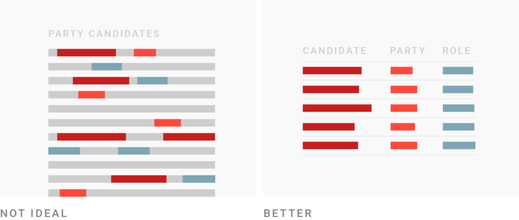
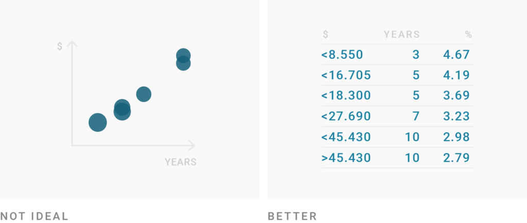
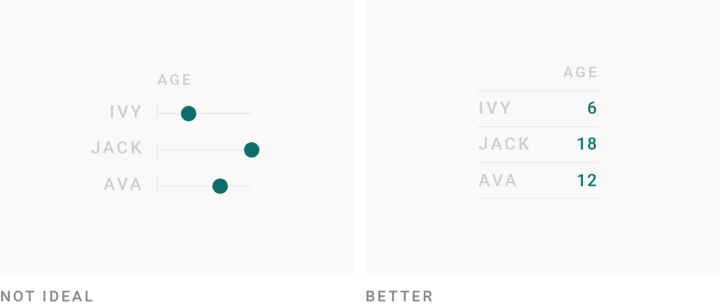
Use tables if you want to enable readers to look up specific information
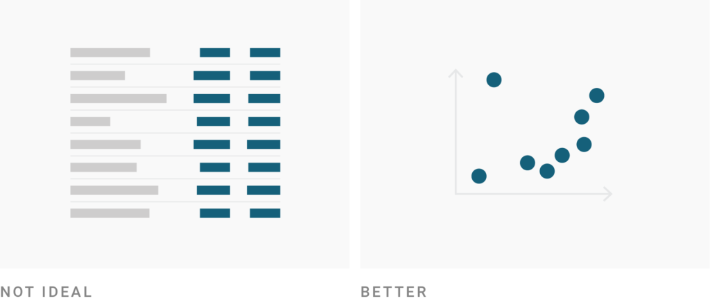
Use charts instead of tables if you want to give an overview of your numerical data or show a pattern
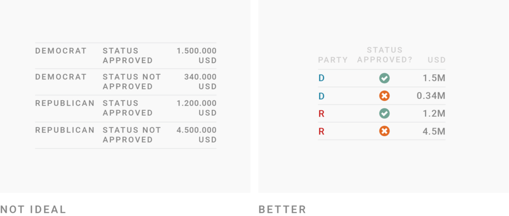
Use tables if precise numbers are important
Tables are great for data we’re used to reading
Tables work better than charts if your readers should compare data in two directions
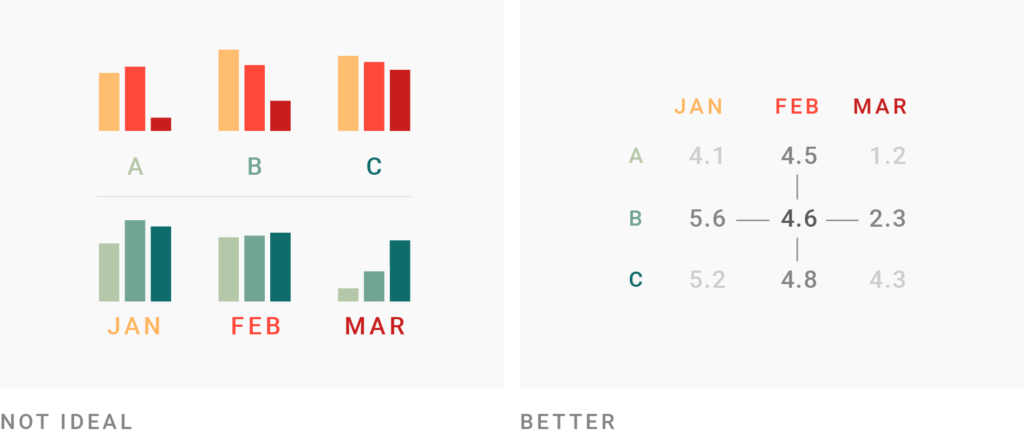
Tables are great for showing ranks

How to create better tables
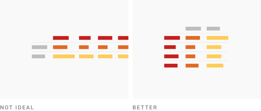
Consider narrowing (down) your columns
Consider structuring your data so that your table has more rows than columns
Consider grey stripes for long tables with many columns

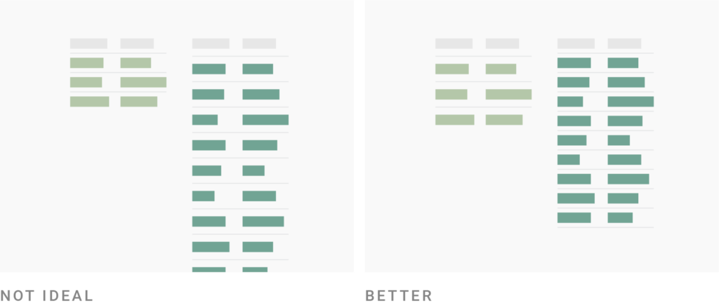
Consider adjusting the row height to the number of rows
Consider pagination for long tables

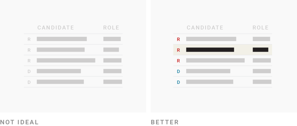
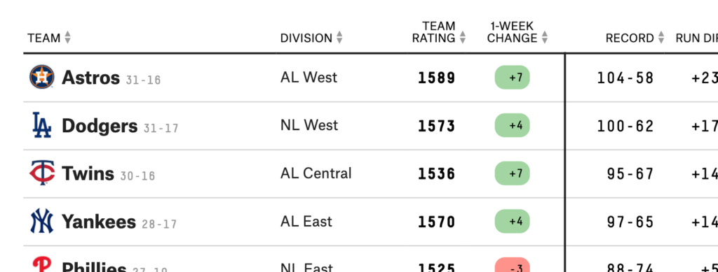
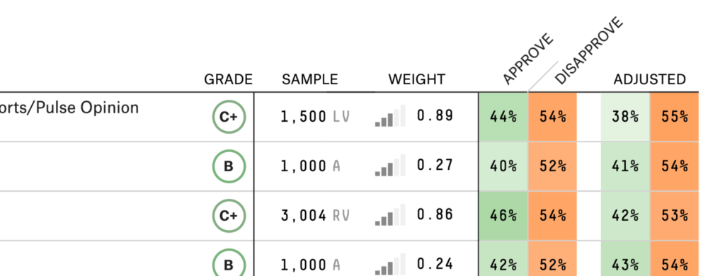
Use colors to lead the reader’s eye to interesting information & help them navigate the table
If your table contains information which is more relevant to some readers, but less relevant to others, consider making your table searchable & sortable

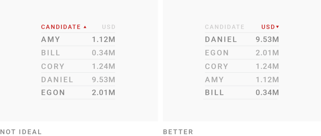
Put some consideration into how your table is sorted
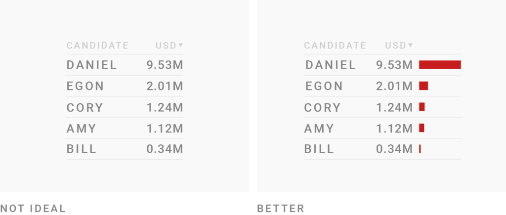
Consider visualizing your data with bar charts
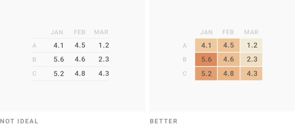
Consider visualizing your data with heatmaps
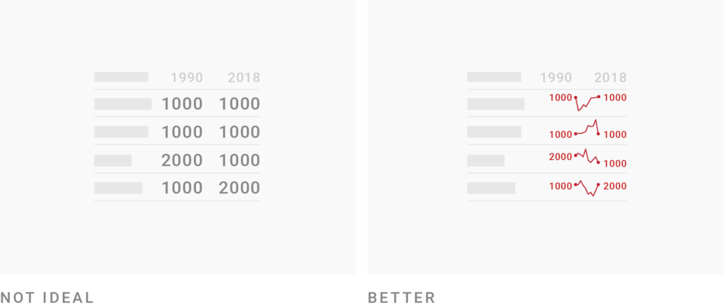
Consider showing development over time instead of just data from two or three time points
Examples of good tables
2019 MLB Predictions
How unpopular is Donald Trump?
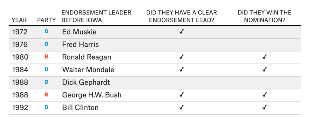
The endorsement leader usually wins
Sources:
Related:
Tags: